Figma design system and components
Product website
App design
The design of our room cards on the Hotel Details page plays a major role in whether users move forward to checkout. We wanted to test whether visual and informational changes could drive more clicks and bookings.
I designed five different room card variants—each with changes to hierarchy, image size, CTA placement, and pricing emphasis—to test against our existing layout.
.png)
.png)

Membership is a key part of Nitecrawler’s growth strategy for 2025, but our existing confirmation page had less than 1% conversion to member sign-ups.
I worked with the product and growth teams to design two new approaches for encouraging sign-up after checkout:
%20(1).png)
.png)
The Challenge:
Unlike the website, where most traffic comes from SEO and lands on the Hotel Details page, the native app experience starts from an intentional search. Most users are already familiar with the brand or are existing members.
The Opportunity:
The Process (So Far):
First, we needed a solid foundation of a style and design system to ensure consistency across all pages and designers. The brand logo, colors, and style were already finalized when I joined, so my task was to integrate these into our design system. Initially, the system was a dynamic document, evolving as we identified necessary components and their optimal appearance on the website. Over time, it became more refined. Consistent use of components, layout, shadows, corner radius, colors, and typography ensured a cohesive look across all pages. This made the product easier to scale as we started adding more designers as well.

 See Full Figma
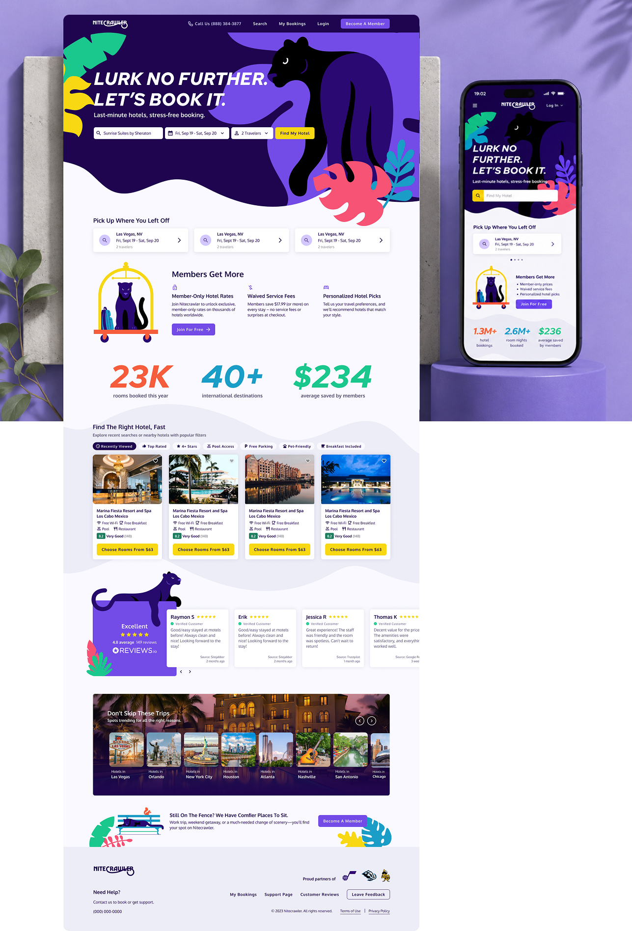
One of my first projects was enhancing the booking experience for Travelpass.com. Collaborating with product managers, we conducted user interviews to understand the strengths and weaknesses of the existing booking process. Users appreciated seeing hotel locations on a map, so we redesigned the search page to feature a split view with a map and hotel cards, similar to Airbnb. We iterated on the hotel cards, refining their composition and information hierarchy.
Key improvements focused on the search and filtering functions, the hotel details page, and the checkout process to ensure a seamless user journey from search to booking.

Another significant project was designing the companion app for bookings. The primary goal was to provide users with easy access to their current, past, and future bookings, along with all the details of their hotel stays. While the app allowed users to search for hotels and resume previous searches, its main focus was to enhance the travel experience by offering a convenient way to manage bookings on a mobile device.
.png)
We set out to develop a tool that empowers users to create and share inspiring travel guides. Through numerous iterations and continuous testing, we’ve actively sought feedback to enhance the user experience and ensure our product meets the needs of our community.


The Shift app launched on the Apple App Store and held a 4.8-star rating—an encouraging sign that users are finding real value in both the content and the experience.

I also designed the responsive marketing site, focusing on:
This was one of the most rewarding long-term projects I’ve worked on, thanks to the close collaboration, mission-driven goals, and focus on emotional design.
Designing Shift reinforced the importance of emotional UX—how small interactions, colors, and flows can influence a user’s sense of calm and connection. Working closely with the founder throughout made this a deeply collaborative and fulfilling process.

%20(1).png)
I developed a modern, trustworthy visual identity:
The UI is intentionally minimal, letting the data take center stage without overwhelming the user.
To support product launch and growth, I designed a responsive marketing site focused on:
.png)
(it's interactive so feel free to click around below!)
MX's platform spans multiple product categories, creating a challenge in communicating a unified story. To improve clarity and usability, we reorganized the website around three strategic pillars—Connectivity, Data, and Experiences—and I developed a visual identity for each through color, iconography, and page-level storytelling.
The result was a more intuitive browsing experience that helped users quickly understand what MX offers, how its products connect, and where to find solutions relevant to their needs.


.png)
.png)

